|
I visited the "Three Powers Plaza" of Brasilia on 2019 (October 1st). Inaugurated on 21 April 1960, and designed by Lúcio Costa and Oscar Niemeyer as part of the Brasilia urban planning, the plaza has become a major tourist attraction of the city. The name comes from the location of the the three governmental powers buildings located around the plaza.
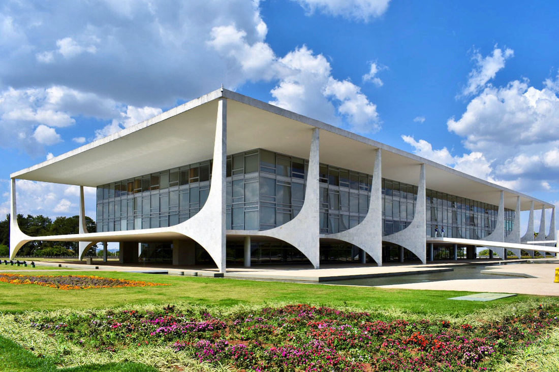 Palácio do Planalto, By Oscar Niemeyer. 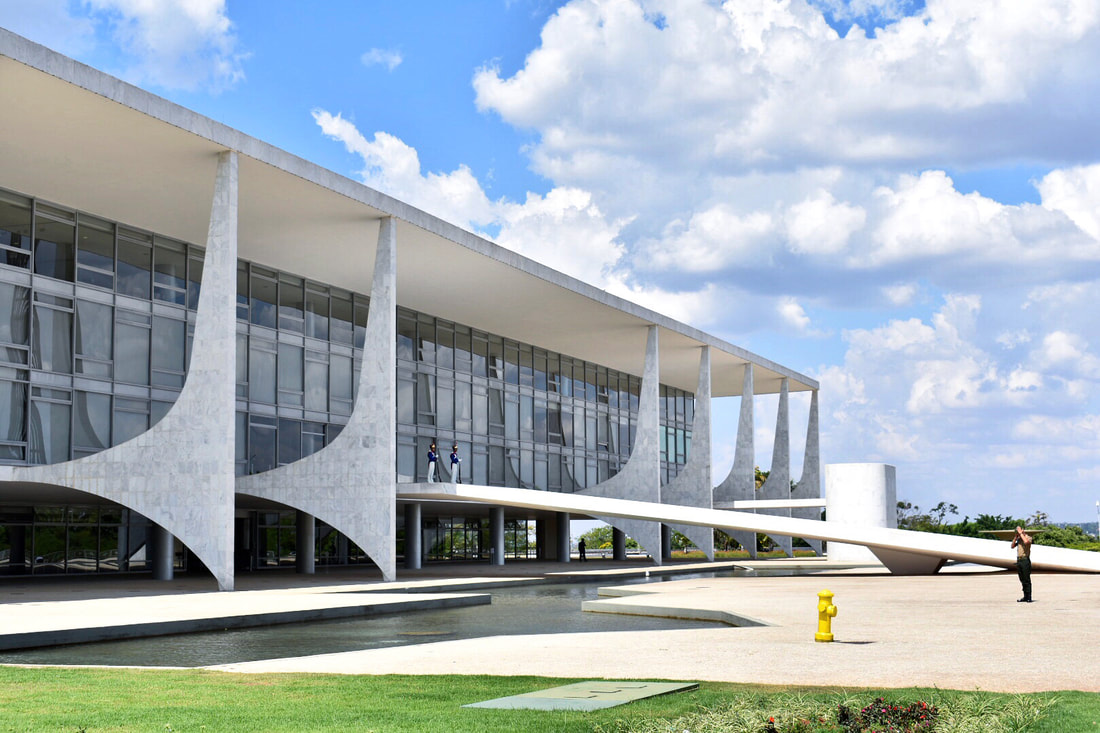 Palácio do Planalto, By Oscar Niemeyer. 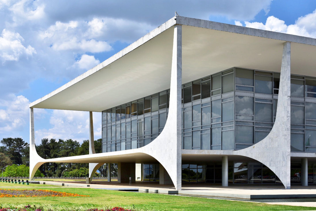 Palácio do Planalto, By Oscar Niemeyer. 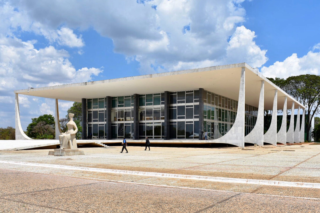 Palácio do Supremo Tribunal Federal, By Oscar Niemeyer. 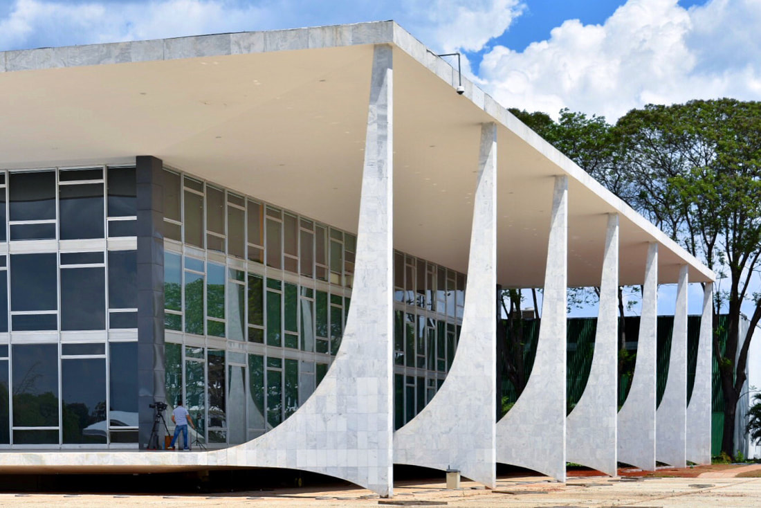 Palácio do Supremo Tribunal Federal, By Oscar Niemeyer. 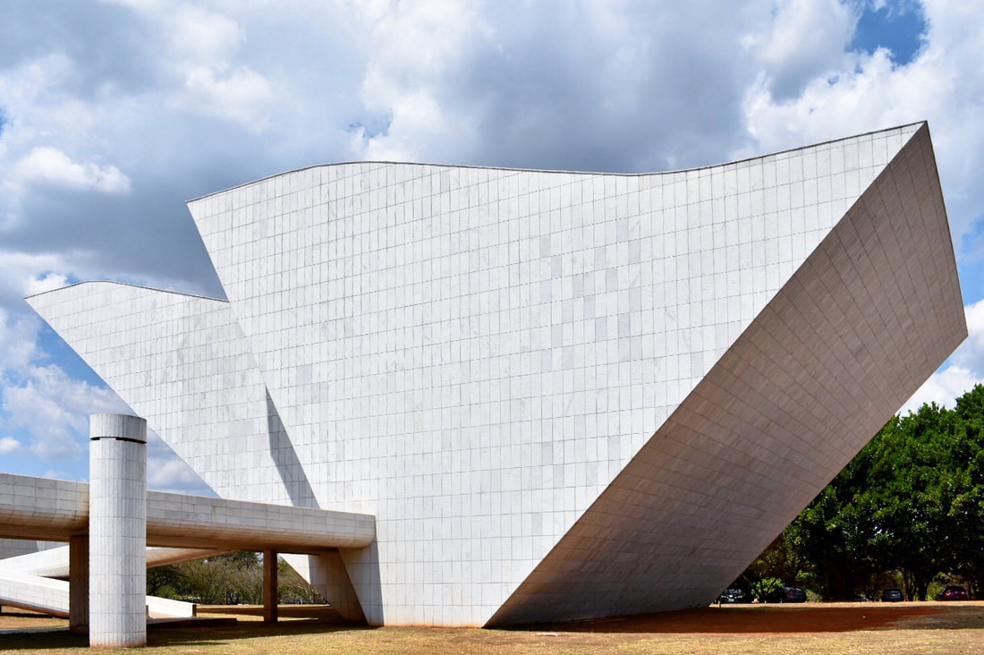 Panteão da Pátria e da Liberdade Tancredo Neves, By Oscar Niemeyer. 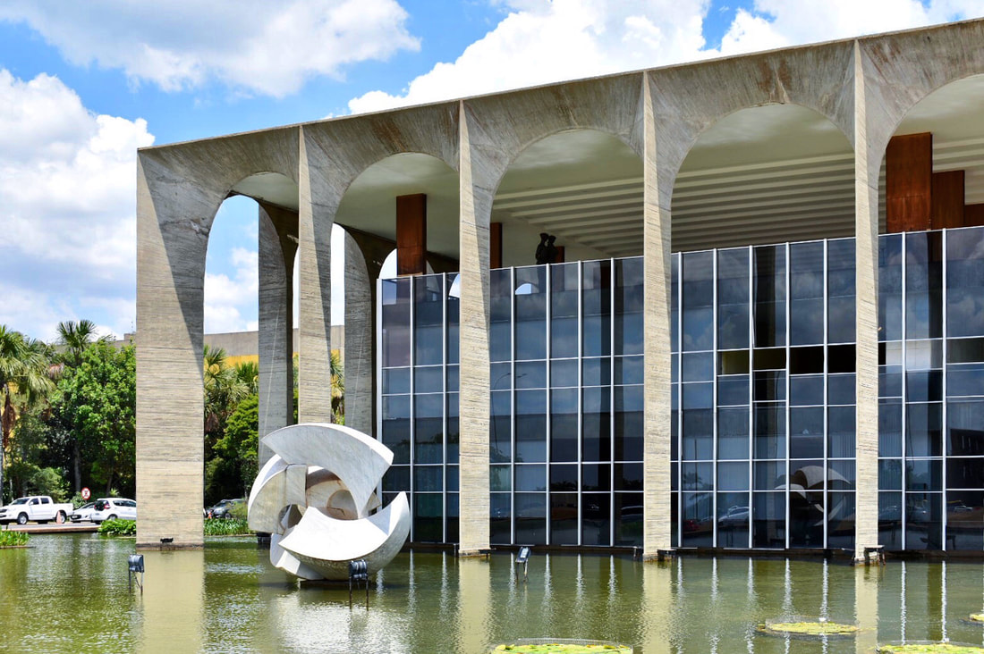 I visited the " Palácio Itamaraty" of Brasilia on 2019 (October 1st). The Itamaraty Palace was designed by Oscar Niemeyer, and open to the public on April 21, 1970 (construction started in 1960). Located in the Monumental Axis, east to the National Congress Building, it's the headquarters of the Brazilian Ministry of Foreign Affairs. 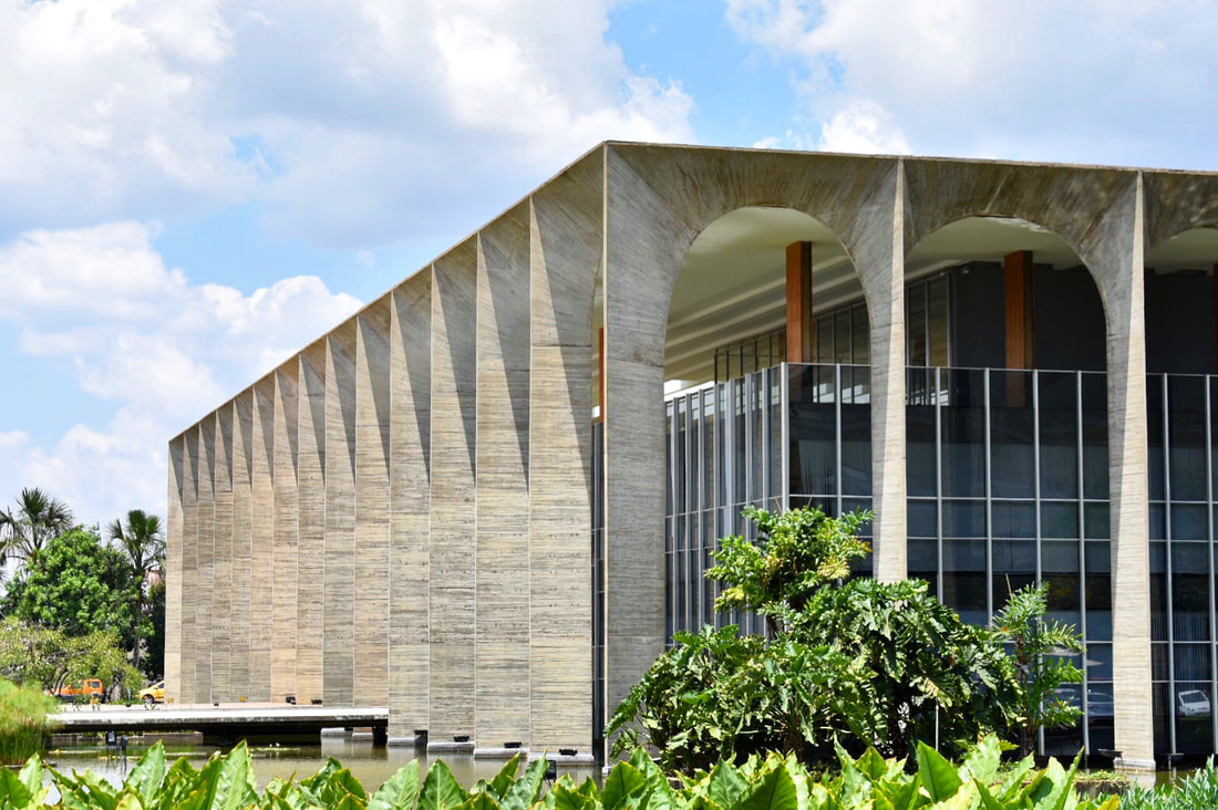 The building is also known as "Palácio dos Arcos" (Palace of the Arches), due to his peculiar facade that consist in a series of similar size semi-circular arches with very narrows lanes. The structure/material is exposed concrete, and was designed by the structural engineer Joaquim Cardozo (designer of most of Niemeyer's buildings). 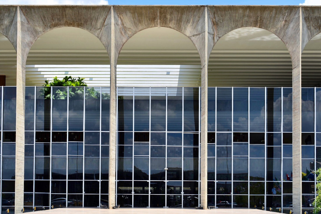 As recurrent theme in all the palaces design by Nimeyer for the city, the architecture consists in in glass box contained between two concrete slabs supported by a colonnade in all facades. The columns have a peculiar trapezoidal shape, that make them look thin from the outside. The interior building (glass box) is structurally independent from the facade building. 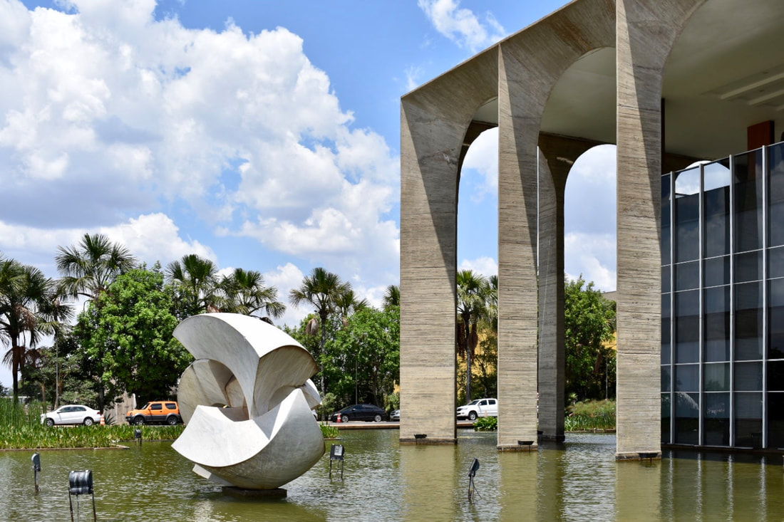 I visited the "Museu Nacional da Republica Honestino Guimaraes" of Brasilia on 2019 (October 1st). 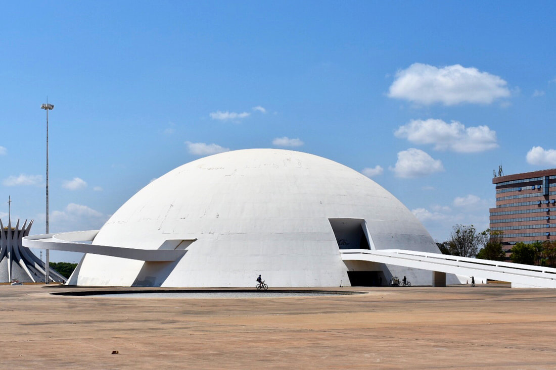 Designed by Oscar Niemeyer and built in 2006 as part of the Cultural Complex of the Republic. Famous for the white dome and the sculptural exterior ramp. The art museum was open to the public in December 15th 2006 (45 years after it was design), the same day that Niemeyer turned 99 years old. The first exhibition was about Niemeyer, called: "Niemeyer & Niemeyer e Brasília – Patrimônio da Humanidade". The building has 14,500 square meters (156,000 sq ft) of exhibit area, and the structure is only concrete. Catedral Metropolitana Nossa Senhrora Aparecida. I visited the Cathedral of Brasilia on 2019 (October 1st). With more than one million visitors each year, this is the most visited place in Brasilia.  Design by Oscar Niemeyer, construction started in 1958 (completed in 1970). 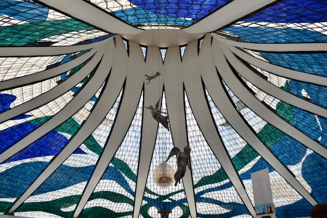 The cathedral is a hyperboloid structure with 16 concrete columns. All columns have a similar shape, a height of 39 meters (131 feet), and this are the only elements in the building with an opaque material. The columns give the cathedral it famous shape, and (as expressed by the architect) represent two hands reaching up towards the sky. The translucent space between columns consist in two layers of covering: The outer roof in fiberglass, and the inner ceiling in stained glass (created by the french artist Marianne Peretti, added in 1990). Most of the cathedral is underground. The nave has a circular plan with 70-meters (230 feet) diameter, and it is surrounded by a 12 meters (39 feet) wide reflecting pool. Visitors have to pass under the reflecting pool to access the cathedral through a dark tunnel. After the tunnel you enter in a very bright and colorful space covered in the stained glass. This is what I love about this building, how from the outside you don’t get a clue of how impressive is the interior. 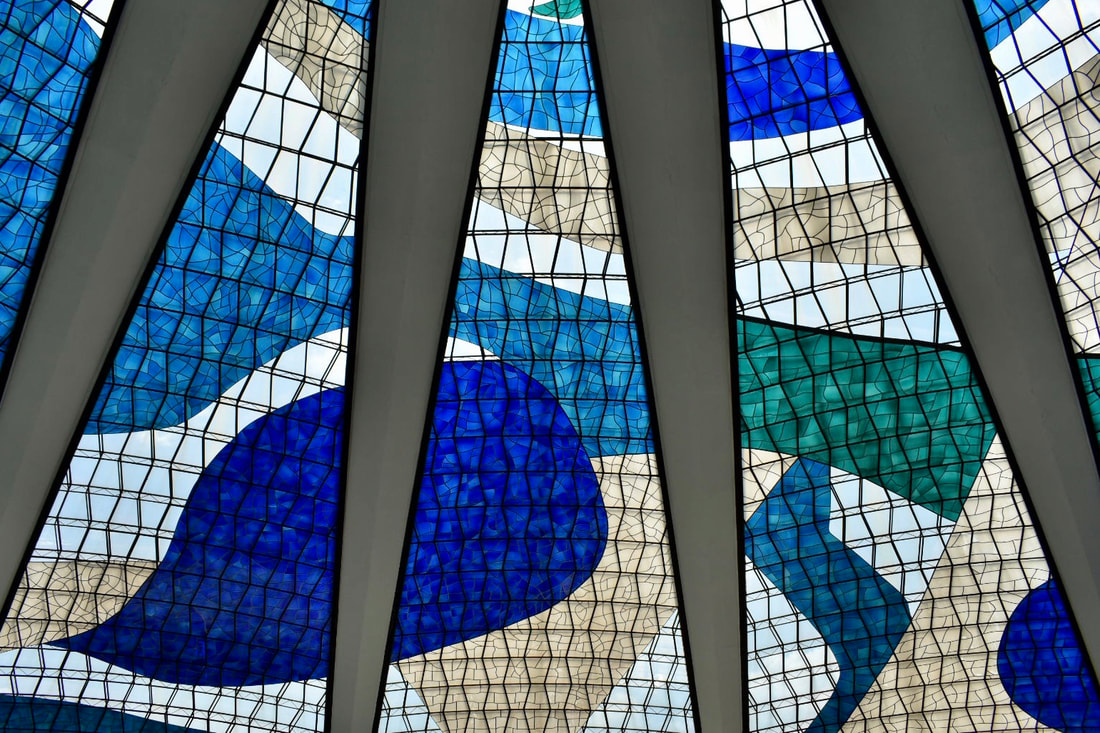 “Eu criei uma galeria escura de modo que, quando a pessoa chegar à nave, tem um contraste de luz: olha e vê até os espaços infinitos; e o corpo da igreja, esplendorosamente transbordante de luz e cor.” Oscar Niemeyer.
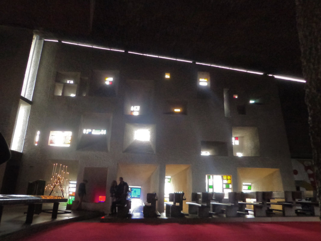
“I created a dark gallery so that when a person arrives to the temple, it has a lighting contrast: look and see even the infinite spaces; and the body of the church, splendidly overflowing with light and color.” Oscar Niemeyer. I visited Brazilian National Congress building in 2019 (October 1st). Brasilia was founded in 1960 and built in just 3 years to be the new capital of Brazil. Named World Heritage Site (by UNESCO) for its modernist architecture and urban planning. 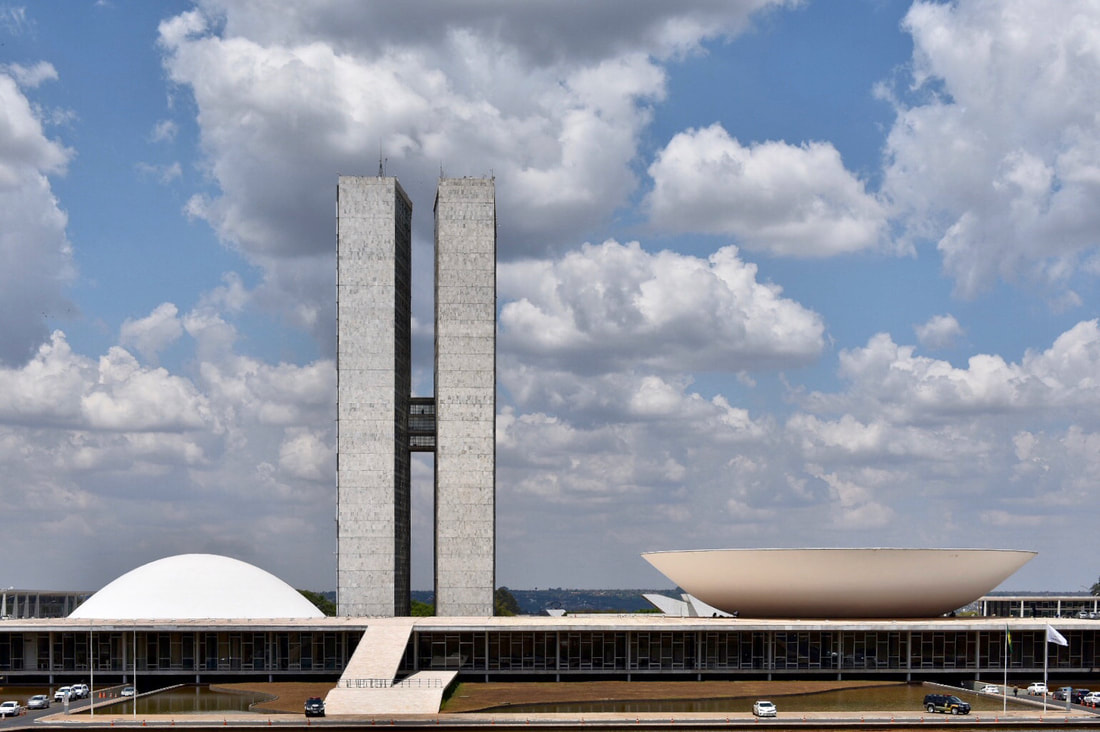 Designed by Oscar Niemeyer, the building is divided by an imaginary line. (In this picture the line would be at 1/3 from the left). Everything on the left to that line is the Federal Senate (81 seats). Everything on the right belongs to the Chamber of Deputies (513 seats) . 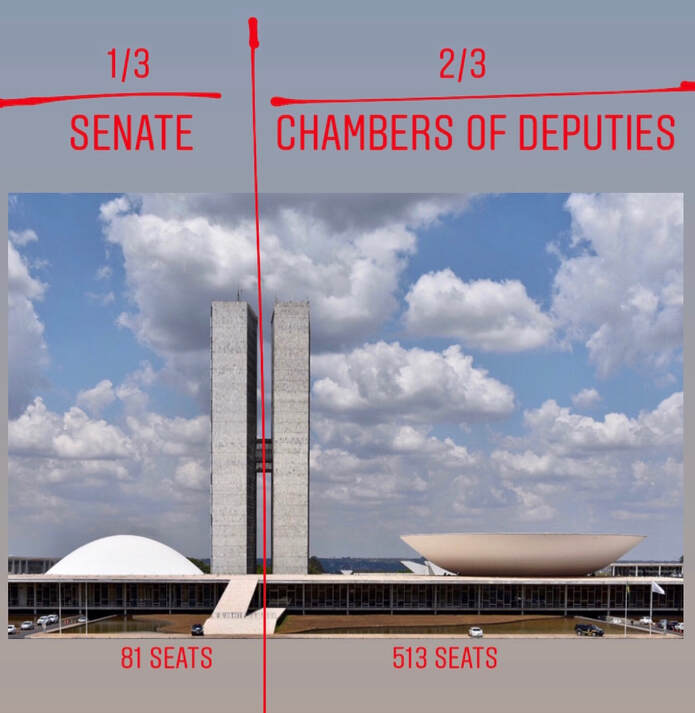 The line represents the balance of legislative power, rather than physical space. Each chamber is aesthetically represented for a cupola (concave for the senate, convex for the chamber of deputies) resting on top of a big base designed to be a public plaza. Never used for this purpose, due to security concerns, the square remains closed to the public. In my opinion, having the square on top the “public servants” building, is a reminder of how democracy works, and how the people has the last say. (In 2013 during a national protest the plaza was taken by the people! - See more pictures of the protest here: shorturl.at/euBNP ) The interior is impressive. The buildings are connected by a series of underground and elevated tunnels, that reinforce the security inside the complex.
I visited the Vitra Campus in 2013 (August 26th). To be honest, I never knew this place existed until I booked my trip to visit Ronchamp, France. What a surprise to find this place where I could visit buildings by Frank Gehry, Herzog & De Meuron, Nicholas Grimshaw, Jean Prouvé, Alvaro Siza, SANAA, and Zaha Hadid. It's an architect paradise! Vitrahaus, by Herzog & De Meuron (2010). I was amazed by this building since I saw the first publication. The whole design concept of these pitched roof boxes stacked one of top of the another, is like a kid creation. The idea of using volumes with the archetypal shape of the house is very appropriate, understanding that the space was design to showcase furnishing and objects for the home. I found very interesting how the lower "house" volume seems to be crushed by the weight of the others. Its a satirical twist for the stackable concept. 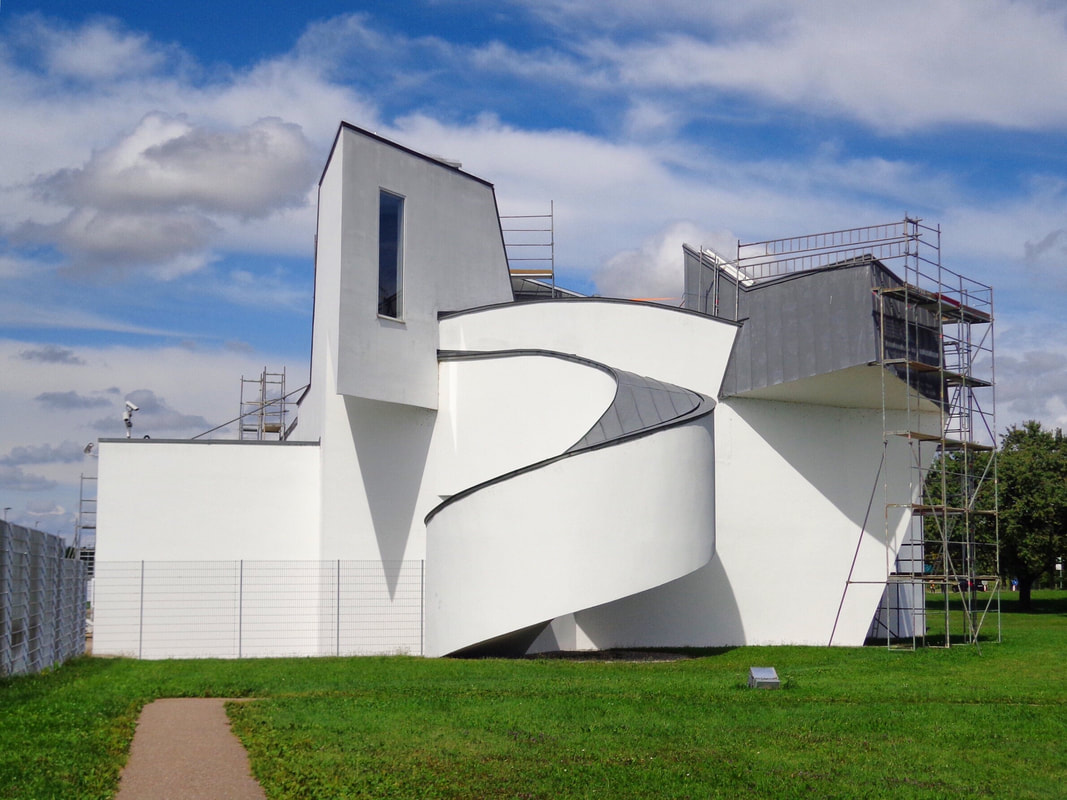 Vitra Design Museum, by Frank Gehry (1989). First building designed by Frank Gehry in Europe. Gehry use his deconstructivist signature, but stayed away from the shining materials he is used to. The building was under reconstruction (what a bummer!). Vitra Fire Station, by Zaha Hadid (1993). The first Zaha Hadid's design to be built. Concrete in pure form and angled planes, shape this building that resemble the earliest Zaha Hadid paintings, for which she was known before officially stepping into architecture design. As described by Hadid: "The building is a representation of 'movement frozen', an 'alert' structure, ready to explode into action at any moment." Perfect design concept for a fire station in a campus that was burn to ashes a decade before. 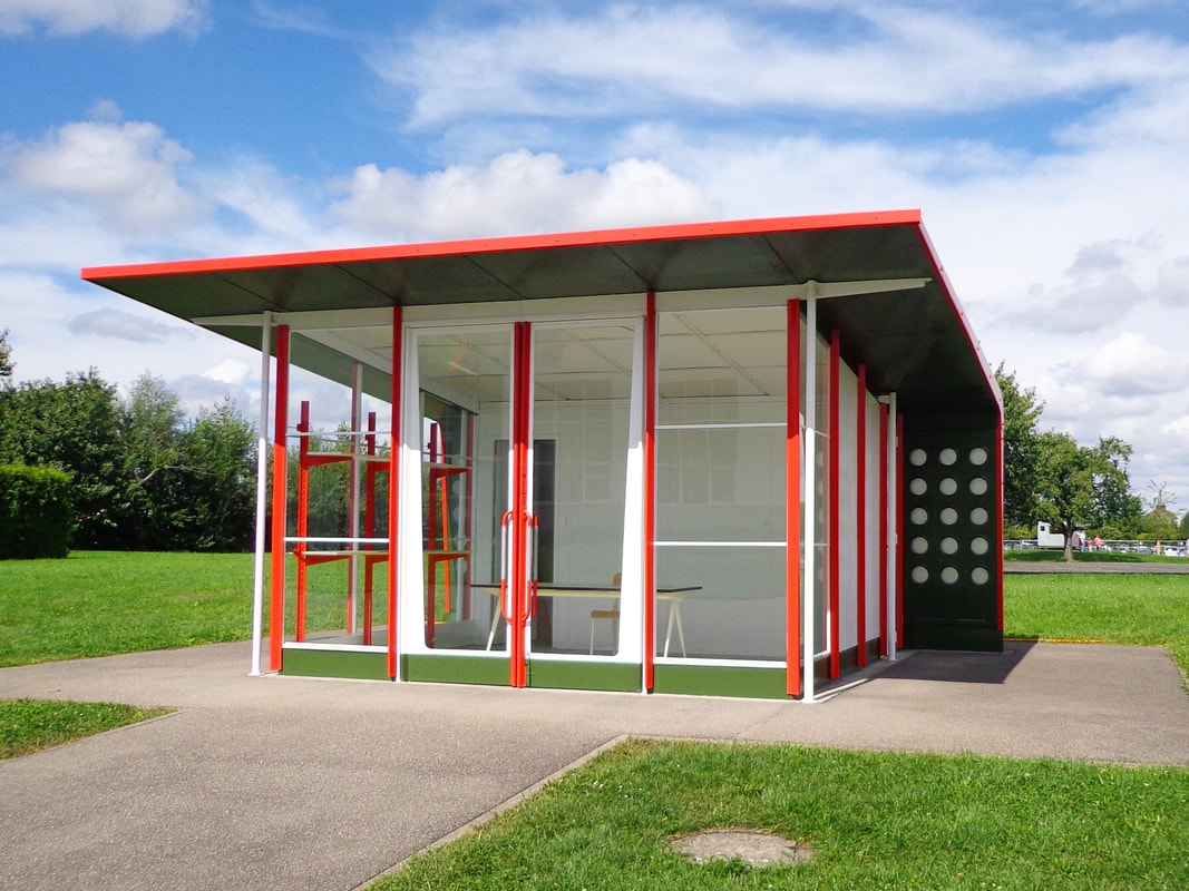 Petrol Station, by Jean Prouvé (Designed and built, 1953 / Installed in campus, 2003). Pioneer in prefabrication, Jean Prouvé proved that it was possible to transfer manufacturing technology from industry to architecture. This model for gas station was design in 1953. Many were built, assemble and installed in France. Vitra installed one of the only remaining stations in 2003. 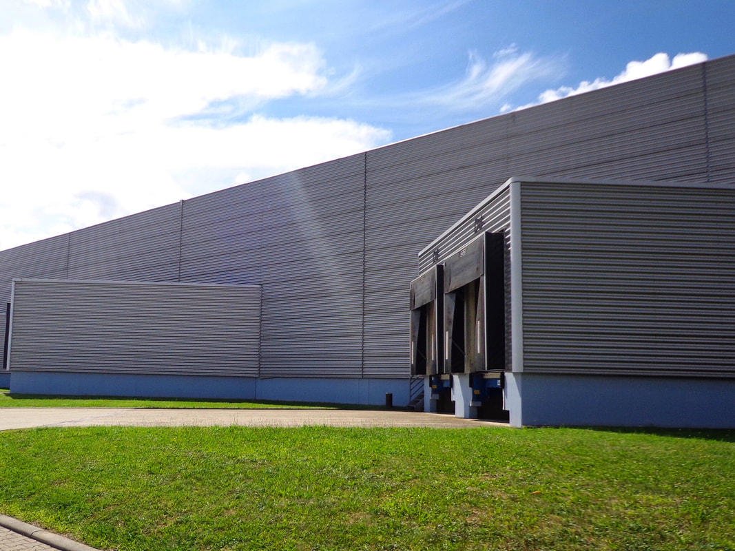 Factory Buildings, by Nicholas Grimshaw (1981). After the famous Vitra fire, Nicholas Grimshaw was the first architect to intervene. Using prefabrication as a tribute to Vitra's industrialization, the building was completed just 6 months after the fire. 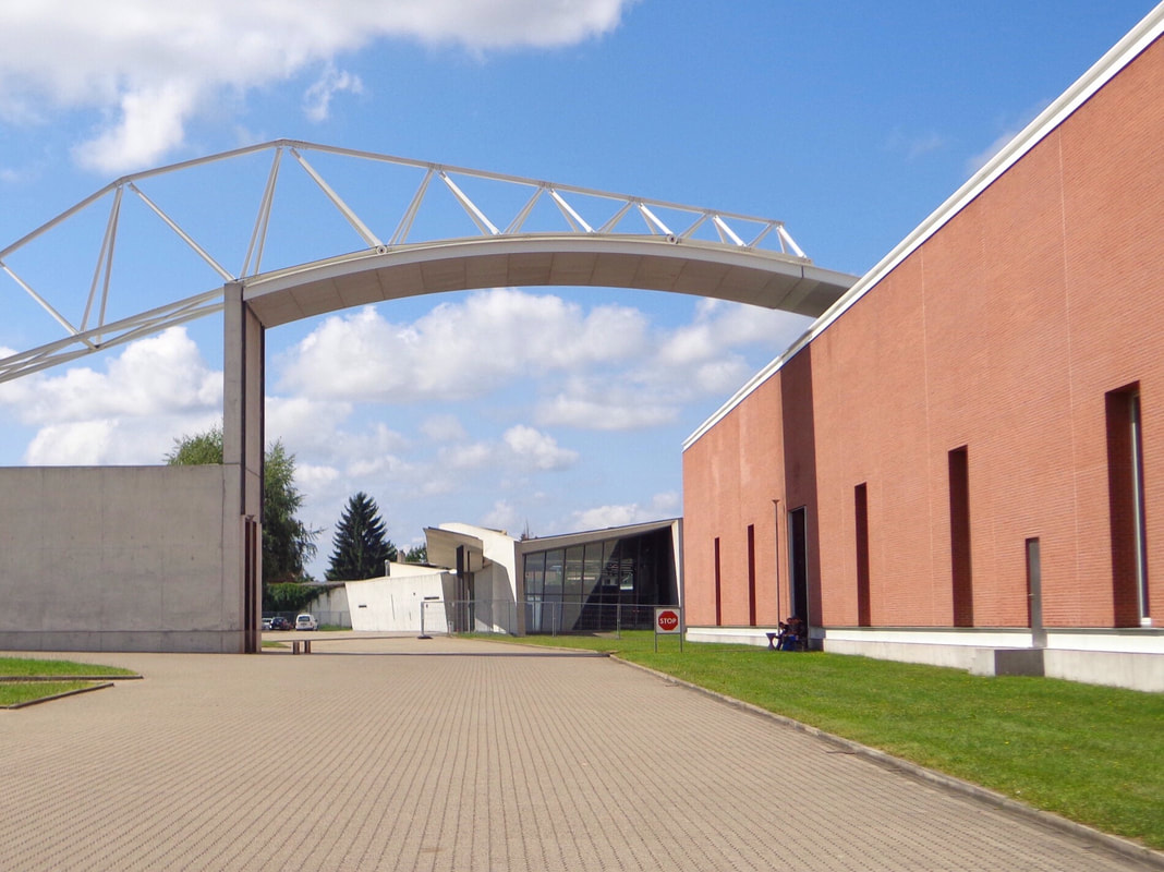 Factory Building, by Alvaro Siza (1994). In 1994, Alvaro Siza design a very simple brick box to be used as factory for Vitra. The most important part of the building is the curved bridge roof, that not only serve as a connection with the adjacent building, but also allows the view to Zaha Hadid previously completed fire station. 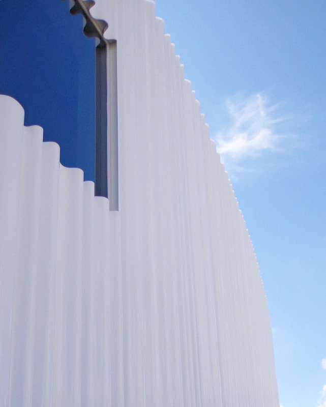 Factory Building, by Kazuyo Sejima & Ryue Nishizawa / SANAA (2012). Almost perfectly circular, this building is cover with a acrylic glass facade with ans undulating surface (like a drape curtain!). The acrylic was made in layers, being the inner layer opaque white and the exterior later completely transparent. This cover the building in a luminous aura. Conference Pavilion, by Tadao Ando (1993).
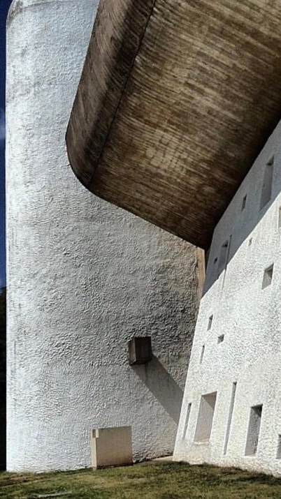
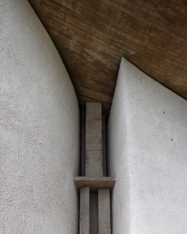
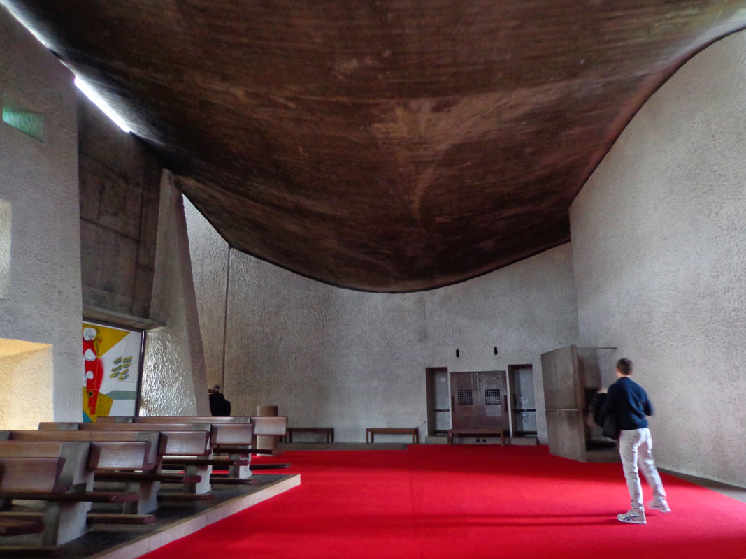
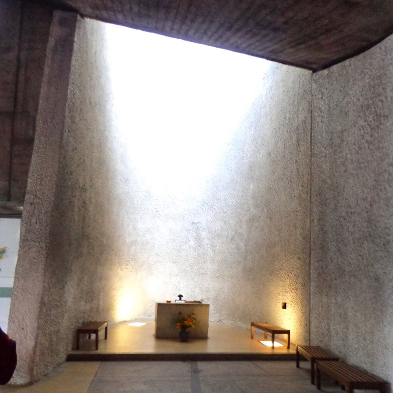
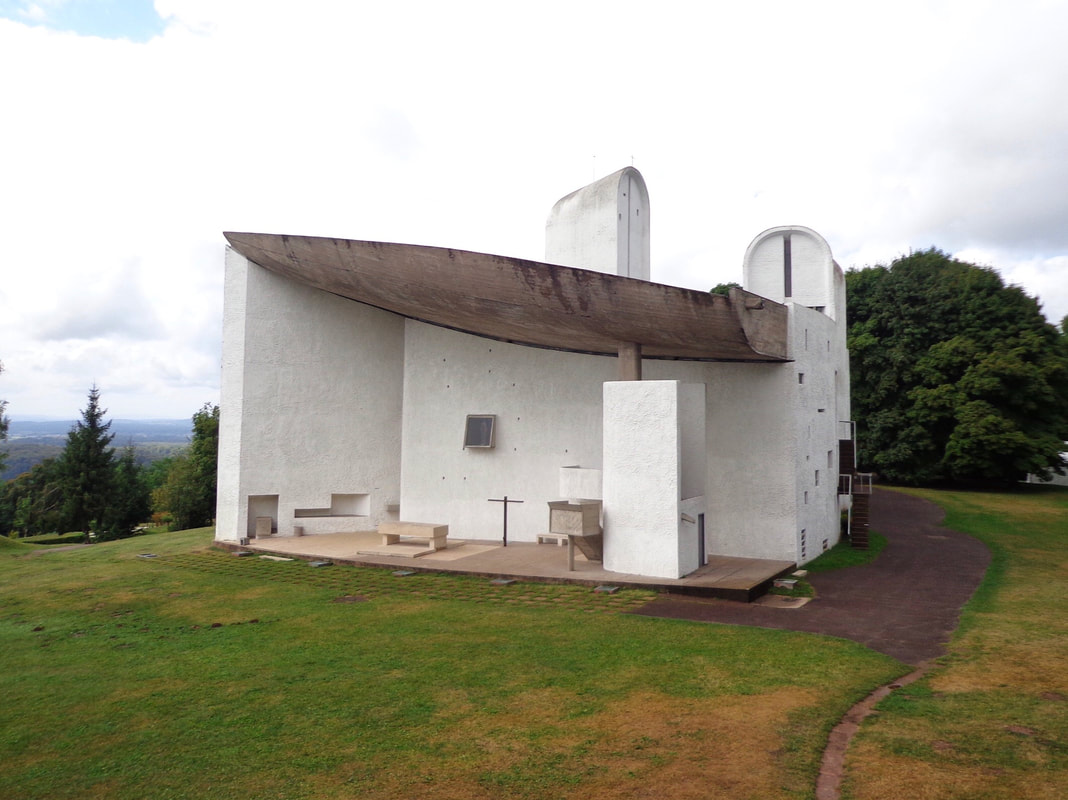
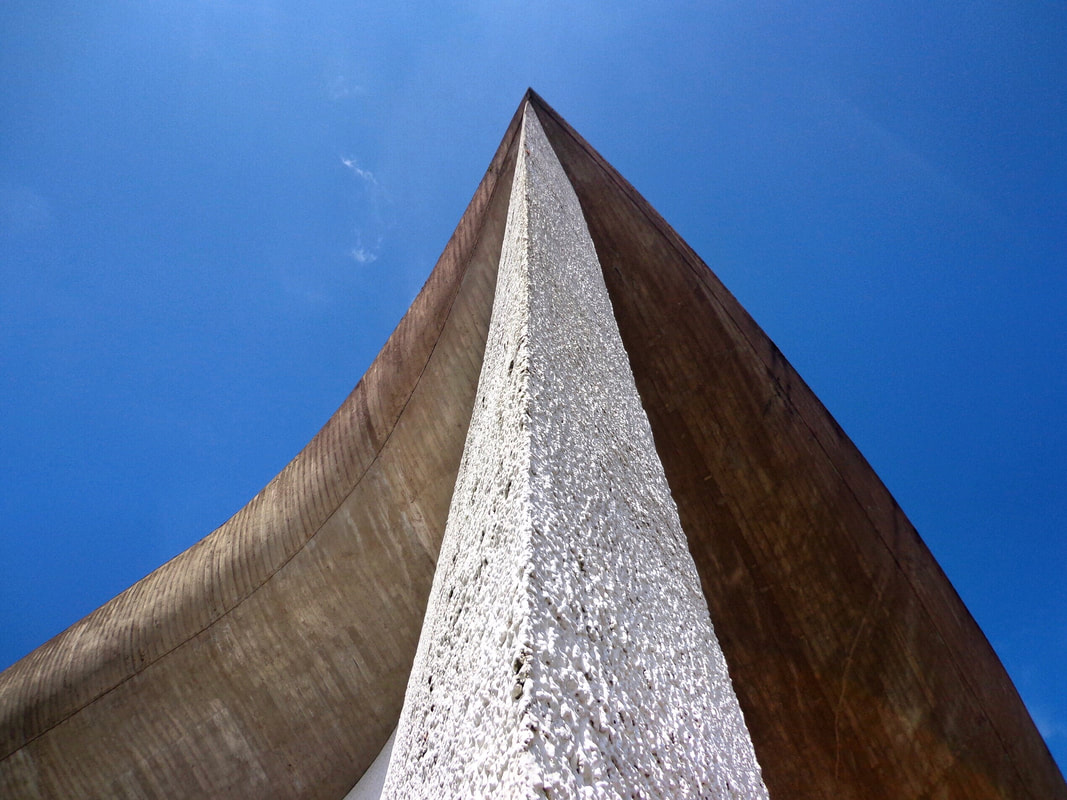
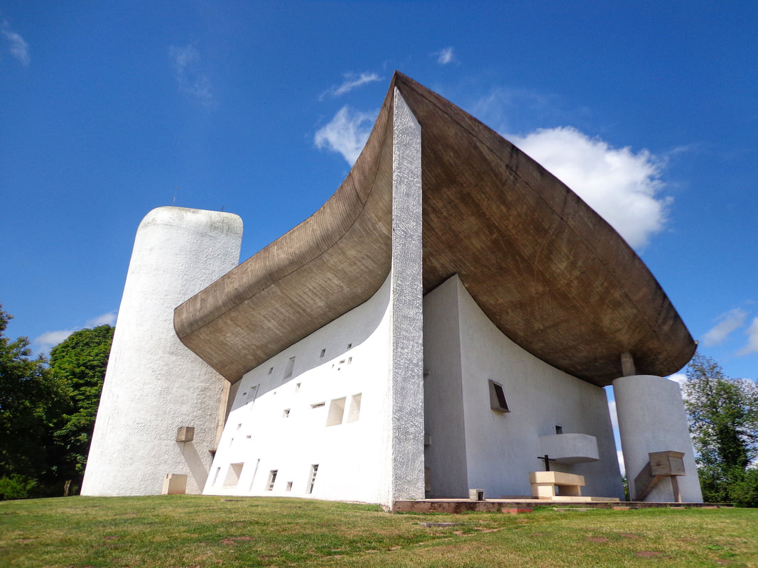
First Tadao Ando building outside Japan. The reminiscence of Japanese architecture can be found in how the space is arrange, and how respectful is the building with the environment. Exposed concrete and simple volumes are Ando's signature. I visited Le Corbusier Chapel in 2013 (August 25th). Wanted to visit this building since the first time a read about it in "architecture history" class many years before. It was my dream, and I was fortunate enough to make it happen.  The closest airport is the "EuroAirport", 92 km (57 mi) away. This is the only airport in the world that is shared by three country: France, Switzerland, and Germany. In the same trip I visited Basel (Switzerland, home of Herzog and De Meuron) and Weil am Rhein (home of Vitra Campus). Both cities will have their own blog entries, hang in there! I was impressed since the moment I stepped on site. The location, the materials, the openings, how the light affects the interior. The beauty of the shape, and how it is revealed slowly while you climb the hill. How it direct your sight straight to the sky. It is breathtaking. Isn't amazing how the roof seems to be floating over the walls? How this heavy looking roof levitates around this irregularly shaped walls, is like a miracle. Interesting enough for a chapel on a hill! The south wall is a master piece on its own. Expands from O to 10' thick (east to west) and curve to the south, inviting to enter the chapel. And it owns the interior space, with openings that slant towards their centers at varying degrees, letting in light at different angles. The roof looks heavy, but feels very light. The 10 cm gap between the roof and the walls make it look like a big concrete mass floating above you. Le Corbusier wrote: "I have not experienced the miracle of faith but I have often known the miracle of inexpressible space, the apotheosis of plastic emotion." That could explains how an outsider could design a religious master piece. |
AuthorArchitect and traveler. Archives
November 2019
Categories
All
|

 RSS Feed
Eye on Architecture |
About Ariel |
|